
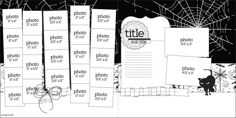
End of the month means you should have at least opened your October kit. If not, it's time to dig in and, at least, use the sketch from Becky Fleck over at PageMaps. I talked about how to use it HERE. Now let's see it in the hands of the Sous Chefs.
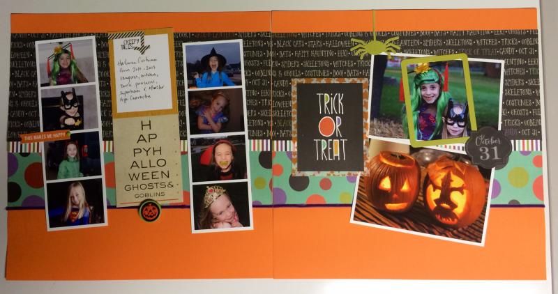
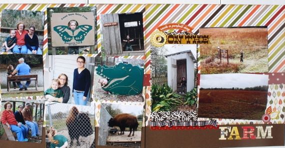
Jennifer (who balked a bit when she saw the sketch's number of photos, LOL) managed to use all but two photos. Her layout follows very closely to the sketch. On the far right strip, she has two long photos, for three photos instead of five. Jennifer is a very linear designer, so I'm sure tilting the photo strips on the left was enough for her, and so she kept her photos on the right straight. She used her Pennant Journaling Card (found with the Fancy Pants True Friend line from the Smaller kit) to hold her journaling and title.
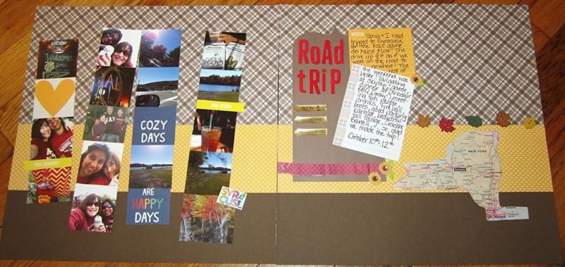
Nancy Longo, also using the Smaller kit, though this is the Lawn Fawn Sweater Weather line, has changed it up quite a bit from the original sketch. She's not only dropped a strip on the left altogether, but she's filled a couple photo spaces with patterned paper and word blocks. She used no photos on the right and opted to use the spots for her journaling. I love the map of New York she's put on the right . . . tells you exactly where she went without a single word written.
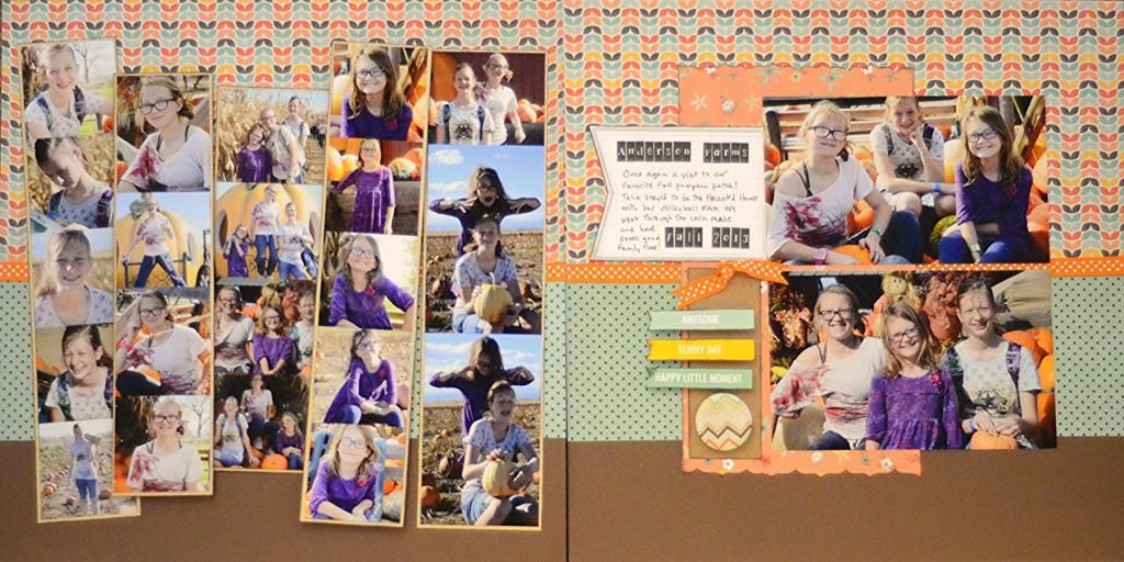
Frankie & Friends by Simple Stories was in the Bigger kit, which Maria Swiatkowski used for her layout which captures the spirit of the sketch. She's opted to drop two of the left-side strips, one being completely substituted with journaling cards. She also showcases only eight photos in her strips. Her right side of the layout is more in line with the sketch, though she's just got her title, in the form of a journaling block, since she's moved the journaling itself to the left side. I love the white borders on the photos which help them pop of the darker background of the layout.
I think this monthly the ladies have certainly shown how to use a sketch as a jumping off place. . .whether you follow it (almost) to the letter, or simply use it to inspire your layout.
Never fear the sketch.

2 comments:
You go girl thats a lot of photos!~
Isn't it awesome
Post a Comment